Interiors writer CAROL BURNS starts off the New Year with a certain coastal colour to the fore of her mind.
It’s a colour that makes up two-thirds of the world’s surface and dominates the sky (on a good day) but blue is the one colour you often can’t touch.
Perhaps that’s why we love to add it to our interior palette so much! For the coastline, there is very little in our sights that doesn’t have a blue hue – even those grey days have a hint of our favourite tint.
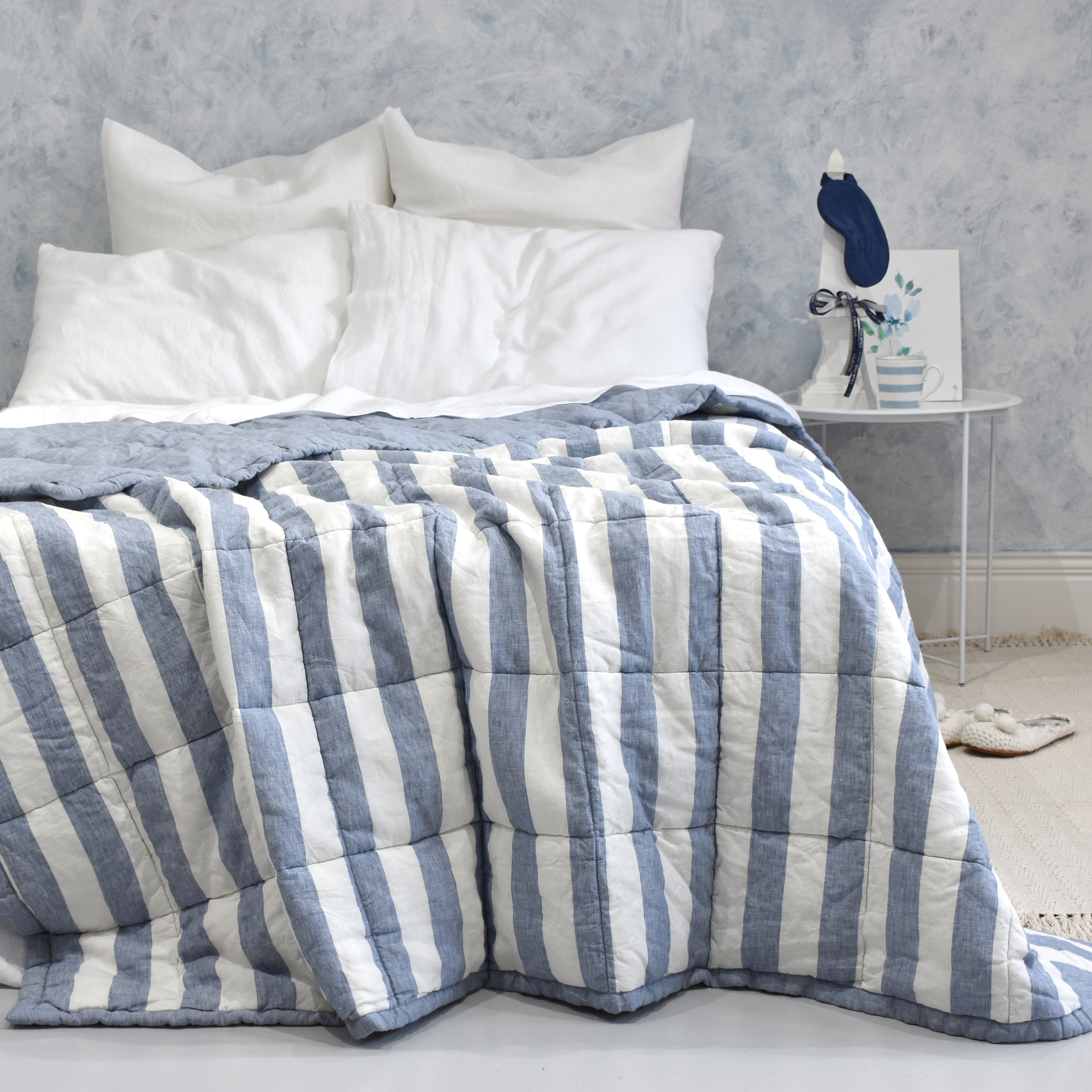
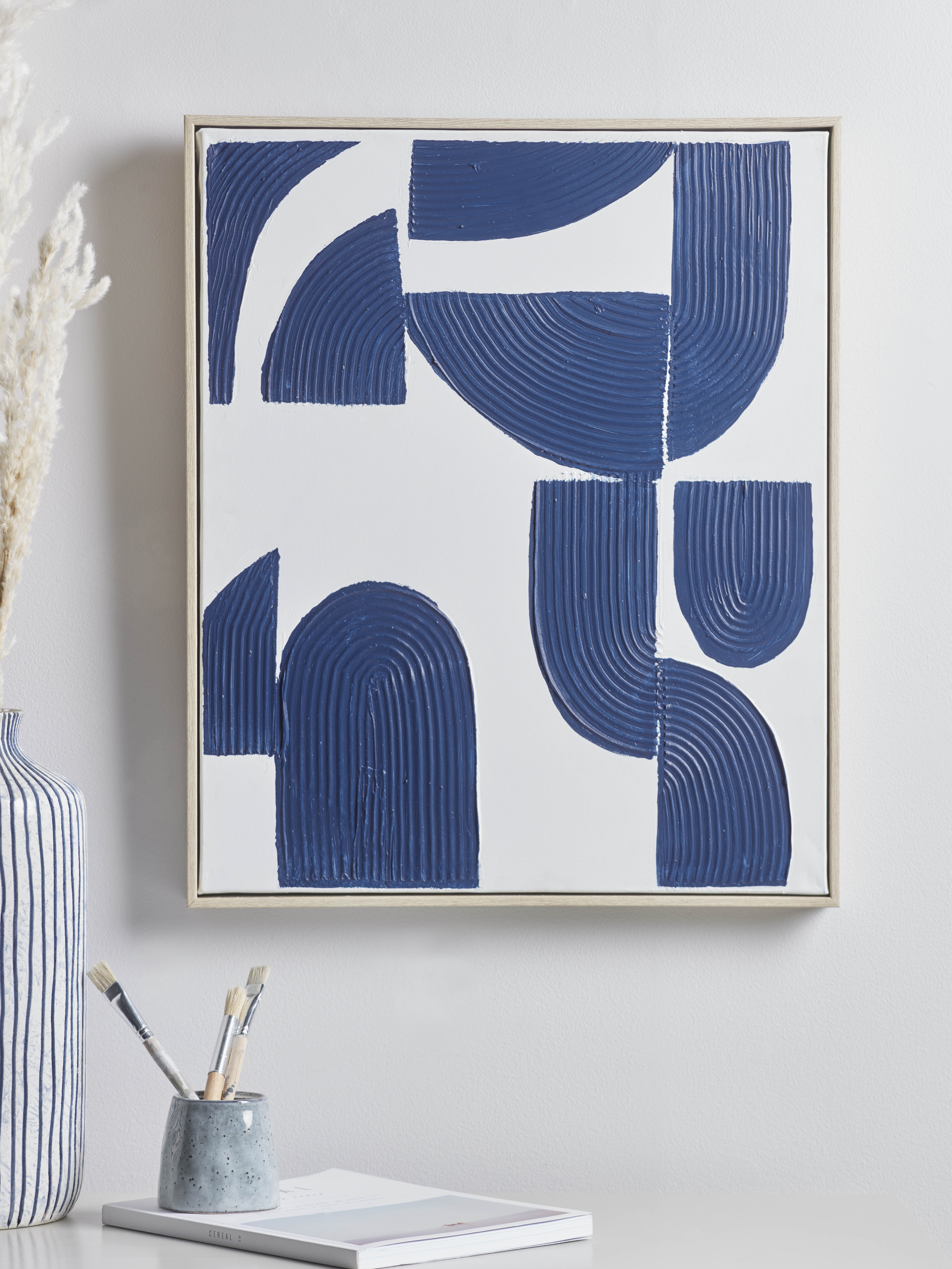
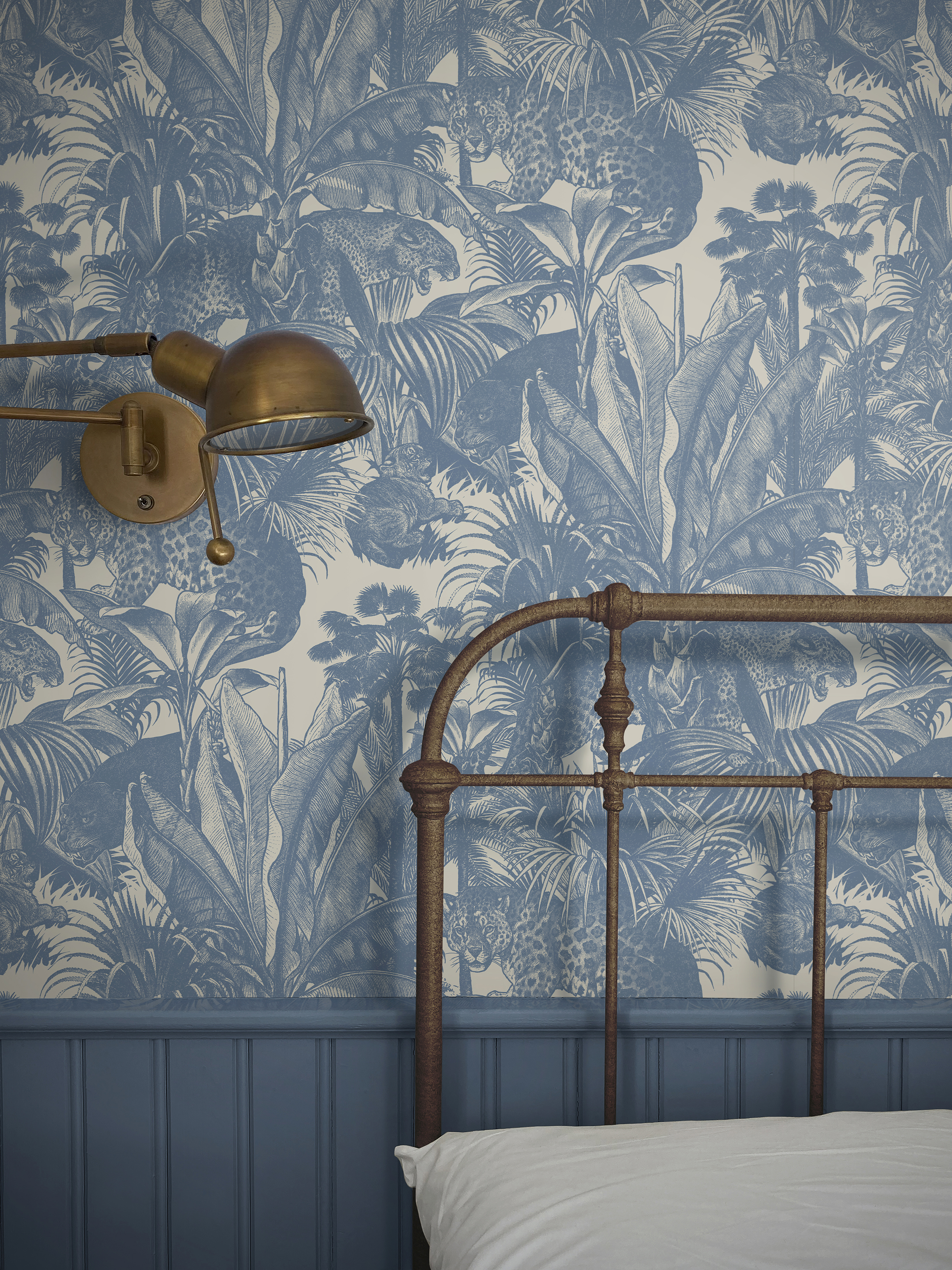
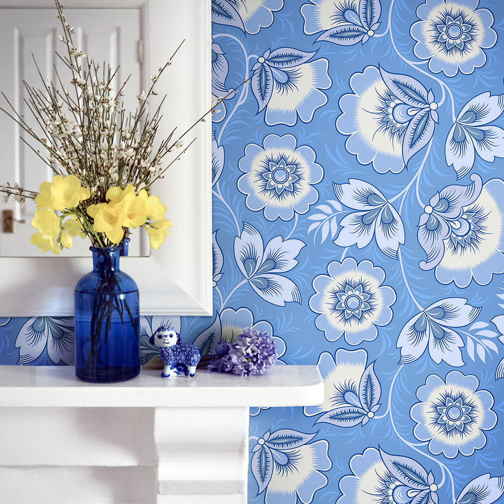
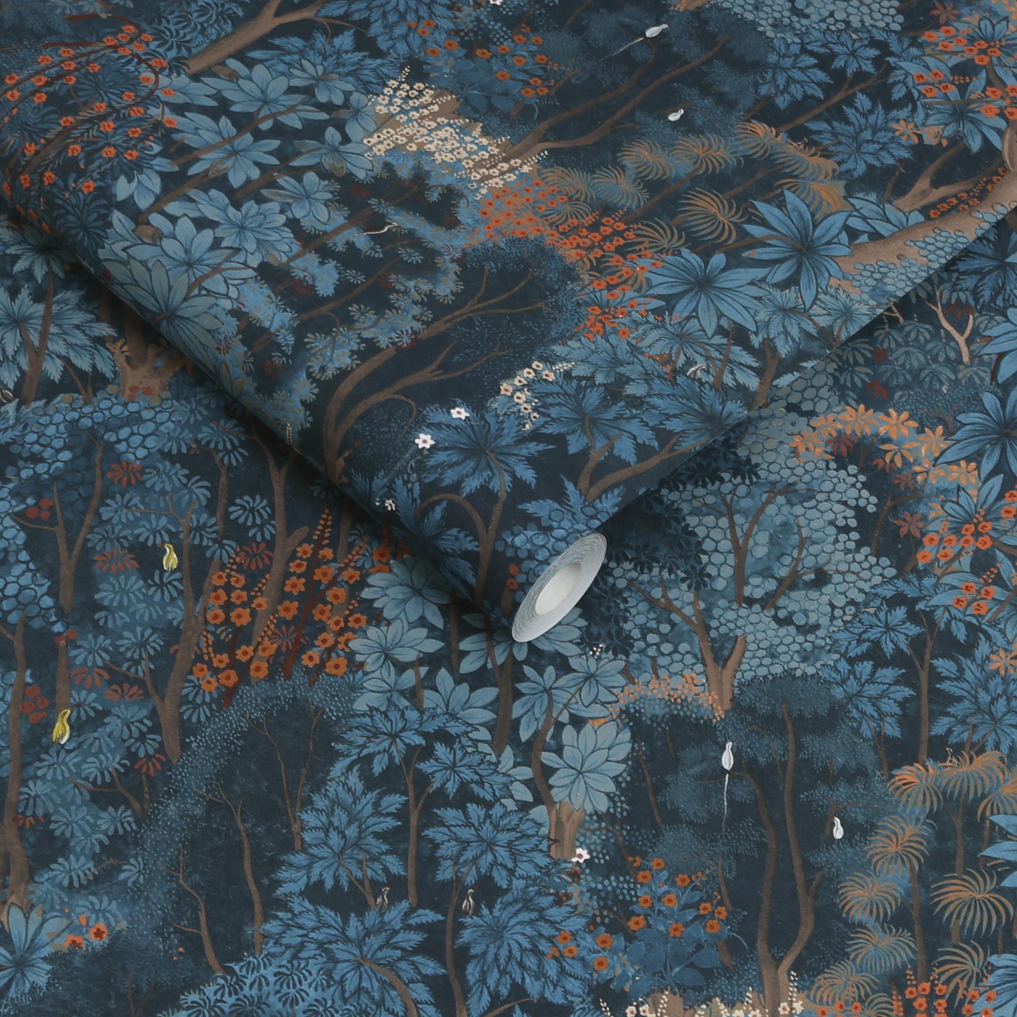
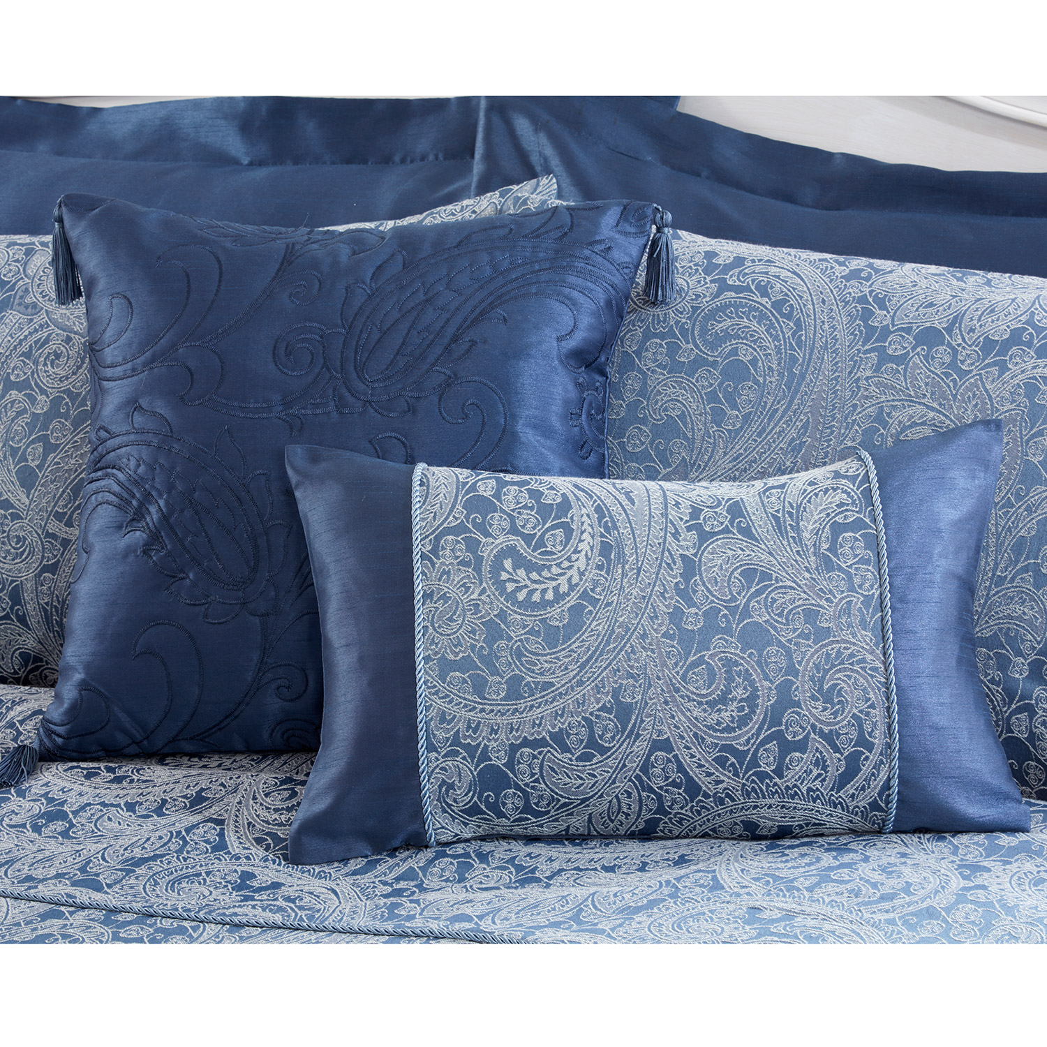
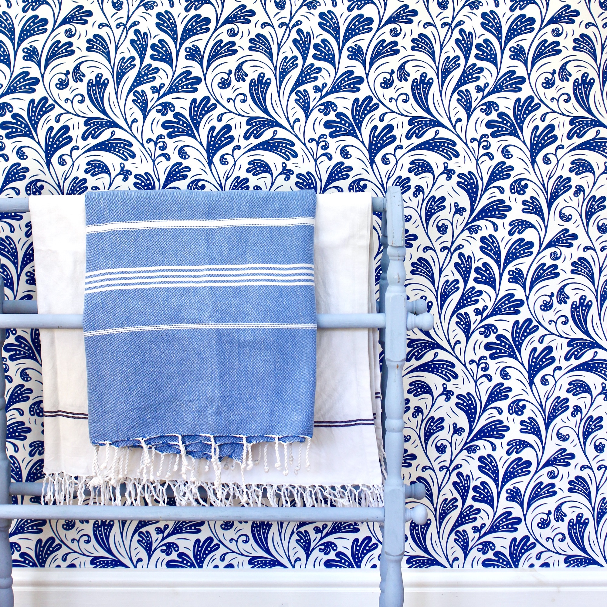
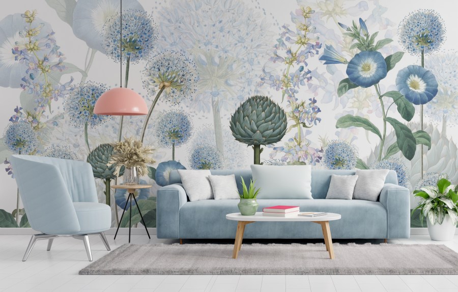
For interiors it has the most varied shades available – and has remained one of the most popular. A classic for ‘water rooms’ like bathrooms and kitchens, darker shades are also beloved for living rooms and bedrooms.
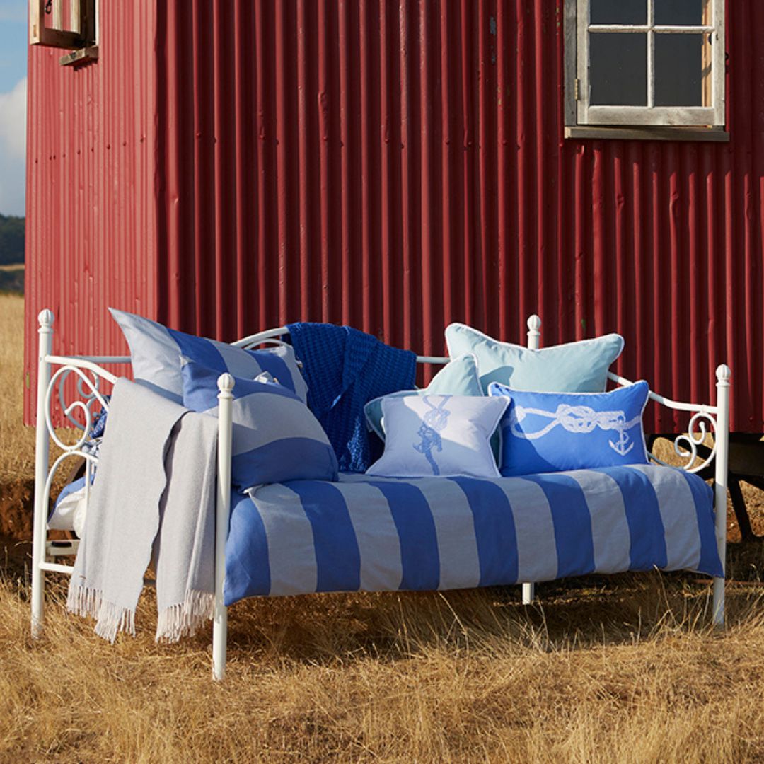
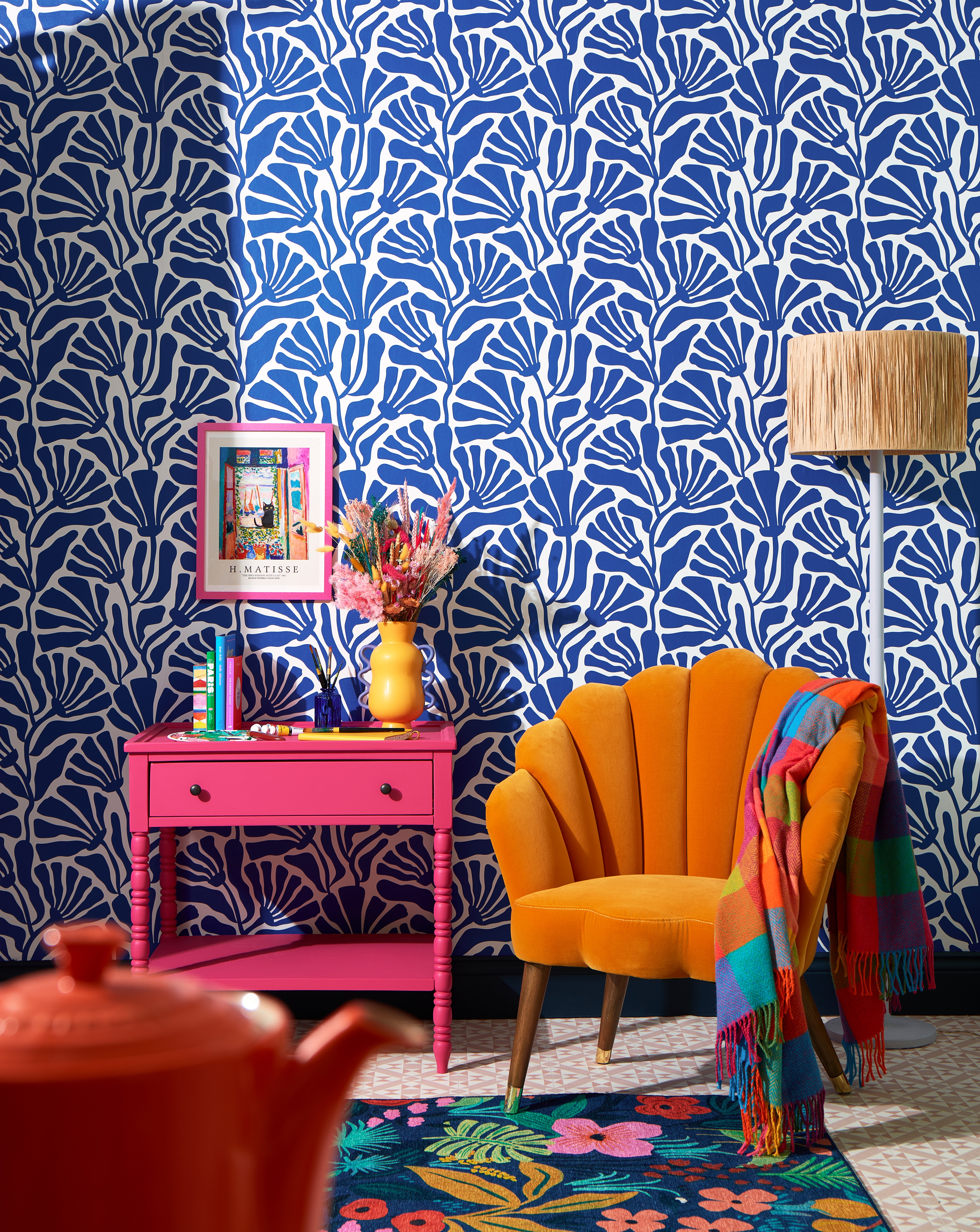
One of the reasons we love blue is that it is easy to use (a word of warning here, never pair brilliant white with blue. Go for cream or off-white tones). You can also mix and match your tones. Blue is a really versatile colour and unlike its primary siblings red and yellow, it works really well in a jumble of different hues.
The trick is to make them look different enough that you haven’t tried to match the exact tones. Go with inky blues and creamy light tones (you’ll find they usually have the word ‘coast ‘ or ‘sea’ in their titles).
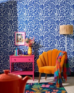
Opposite colours that will make your blue zing is orange. Use it sparingly: the idea is to set blue off to its best, not damage your eyes. If you love piles of cushions on your sofa, have four blue and one orange. See Joan Miro’s series of Blue paintings and you will get the idea.
Happily, the doyenne of colour that is Pantone has chosen a blue tone for its Colour of the Year for 2024. Chambray Blue is described as a “brightened denim blue infused with an easy vitality”. The Pantone colour system creates signature colours complete with the recipe that allow interiors companies (as well as fashion houses) to create the exact same shade. Expect to see Chambray Blue everywhere in the spring collections.
The beauty of blue is also in its ease. You can use it everywhere without it overwhelming. Our eyes are so used to seeing blue in the sea and sky that dominates the coastline, that we are more than happy to see it inside our homes. It is calming, soothing and familiar. It also offers a touch of luxury.
The original pigment was created using the semi-precious lapis lazuli to create the colour we call ultramarine – once worth five times as much as gold. It was adored by the Egyptians who used it to display their wealth: Egyptian tombs are full of it and where would we be without Cleopatra’s famous blue eyeshadow (no, that wasn’t just Elizabeth Taylor!).
Blue also works in many different textures: hard surfaces like tiling, woods and metal and on textiles like curtains, sofas, cushions and rugs. It really is a versatile colour – and one that the experts say has a positive impact on our well-being. If that’s not a great excuse to browse blue mood boards on Pinterest what is?